FontMaker
Every letter on a screen is a small drawing that a computer repeats every time you type it. FontMaker lets a student draw their own. It opens on a complete pixel font: change a few squares of the A, type your name in the preview, and read it back in a typeface you made. Free, in the browser, no account needed to try it.
Using this with a class? Make a free class and add your students yourself: each gets a username and password, with no email or Google account needed. Or give them one join code.A first lesson: Everyone redraws the five letters of one word so they share a single style, then the room has to guess each word's mood from the letters alone.
Set up a free classWhat a student actually does
They click squares on the A and it changes. They type their name into the preview, and there is their A, in their own name. Then they pick another letter and start giving the font a personality: heavier, rounder, taller, spikier. After a few letters they notice that the letters have to agree with each other, and that is when they start designing a typeface rather than drawing pictures.
From there it is a proper editor. Pencil, eraser, fill, line and move tools; mirror mode for symmetric letters; flip, shift and center; copy one letter as the start of another; undo for every letter. Grids run from 5 by 5 up to 32 by 32. All 95 printable characters are there, including numbers and punctuation, and the finished font downloads as a file to try on their own computer.
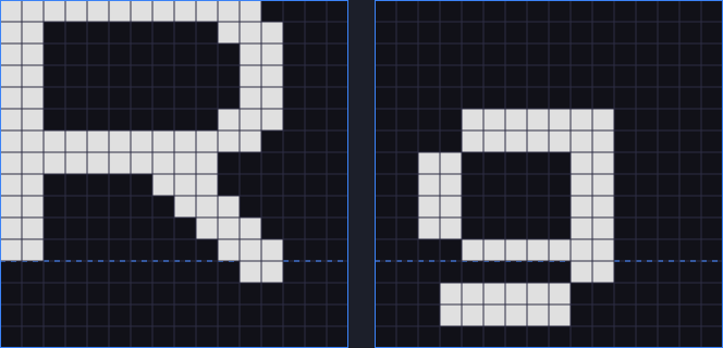
The dashed line is the baseline, the line text sits on. The R stands on it; the g sits on it too and drops its tail below, which is called a descender. Get that line wrong on one letter and the whole word looks like it is bouncing. That is the first thing a type designer checks.
What they are learning while they play
Nothing here is presented as a lesson. This is what the activity is made of.
| What the student does | What it is |
|---|---|
| Changes squares on a letter | Bitmaps. A pixel font is a grid of on and off squares for each character. Screens draw everything this way underneath. |
| Types their name in the preview | Character codes. Every key is a number, like 65 for A. The font is a lookup from each number to its drawing. |
| Lines letters up on the dashed line | Baseline and descenders. Text sits on a shared line. Letters like g, p and y hang below it, and getting that right makes words read smoothly. |
| Makes letters match each other | Typeface design. A font is a family. Stroke weight, height and corners repeat across every letter so they read as one voice. |
| Turns on mirror mode for an A or an O | Symmetry. Many letters are symmetric, so drawing one half and mirroring it is both faster and neater. |
| Tries a 5 by 5 grid, then 32 by 32 | Resolution. Fewer squares means blockier letters. More squares allow curves, at the cost of more work per letter. |
| Asks whether a letter is readable | Legibility. An l, a 1 and an I can easily look identical. Designers make them different on purpose. |
| Downloads the finished font | Vector outlines. The export turns the squares into outlines, the same kind of shapes every font on a computer is made of. |
How to tell whether it landed
Ask, and let them show you. A student who has understood it can answer these without help.
- What is a letter made of in this font?
- Why does the g go below the dashed line when the a does not?
- In your font, can you tell an l from a 1 from an I? How?
- Pick two of your letters that do not look like they belong together. What would you change?
- What happens to your letters if the grid is only 5 squares wide?
Practical notes
- AgesAges 8 through high school. Younger students restyle a few letters and type their names; older ones design a consistent set and think about legibility.
- TimeSeconds to the first change. A word in a consistent style takes twenty to forty minutes; a full alphabet is a project over several sessions.
- EquipmentAny computer or Chromebook with a modern browser. A mouse helps. Nothing to install.
- CostFree. The app has no paid tier.
- PrepNone. Open the page and go. Reading this page first takes about three minutes.
- In a groupEveryone can restyle the same word, and the room can compare how much a font changes how it feels.
For co-ops, microschools, and classrooms
Hand out one word, say BRAVE or quiet, and have everyone restyle its letters until the word looks like what it means. It takes one session, the results go straight up on a screen, and it opens the conversation about why fonts look the way they do.
- Starts from a complete font, so nobody faces an empty grid.
- Grids from 5 by 5 to 32 by 32.
- All 95 printable characters, including numbers and punctuation.
- No install, no per-seat license. Student work is private by default.
Common questions
Is FontMaker free?
Yes. It runs in your browser and there is no paid tier. A free account adds saving, but nothing on this page is behind a paywall.
Does my child need an account to try it?
No. The demo on this page is the complete editor with a starter font. Make a free account and the font you changed comes with you as your first project.
Can they use the font they make?
Yes. It downloads as a font file to try on your own computer, and with an account a student can use it for the text on their portfolio page.
What ages is it for?
Ages 8 through high school. Changing a few letters works for anyone; designing a consistent alphabet suits older students.
Does it install anything, and will it work on a Chromebook?
It installs nothing and runs in any modern browser, Chromebooks included.
What subject can I log this as?
Most families log it as art or design. Typeface design and legibility are design, character codes and bitmaps are computing, and symmetry and grids are math. The table above lists specifically what is covered, so you can pick the label your records need and point at the evidence.
Where to go next
Start with FontMaker
Trying it costs nothing and takes about five minutes. An account is what makes the work last.
FontMaker is one of the making apps on the platform. It is a place to make things, not a course, and it is not a substitute for a teacher: it is at its best when an adult asks the questions above and takes the answers seriously.
Page last reviewed September 2026.